Company
Moz Pro
My Role
Design Lead
Dev Lead
Casey Coates
Redesigning our outdated navigation system to create a smoother, more intuitive experience that scales with our growing product.
As our web app expanded with more pages and features, the old navigation just couldn’t keep up—users were getting lost. I tackled this by doing mainly two things:
Running in-depth user research to pinpoint the biggest pain points.
Working closely with cross-functional teams to make sure the new design wouldn’t disrupt their workflows.
The result: A modern, interactive navigation system that scales with our product, reduces clicks, and keeps users on high-value pages—ultimately driving more profit.
Core Event Adoption
Clicks per Task
The project kicked off in response to plenty of user feedback highlighting how outdated the old nav UI was and how difficult to use it…
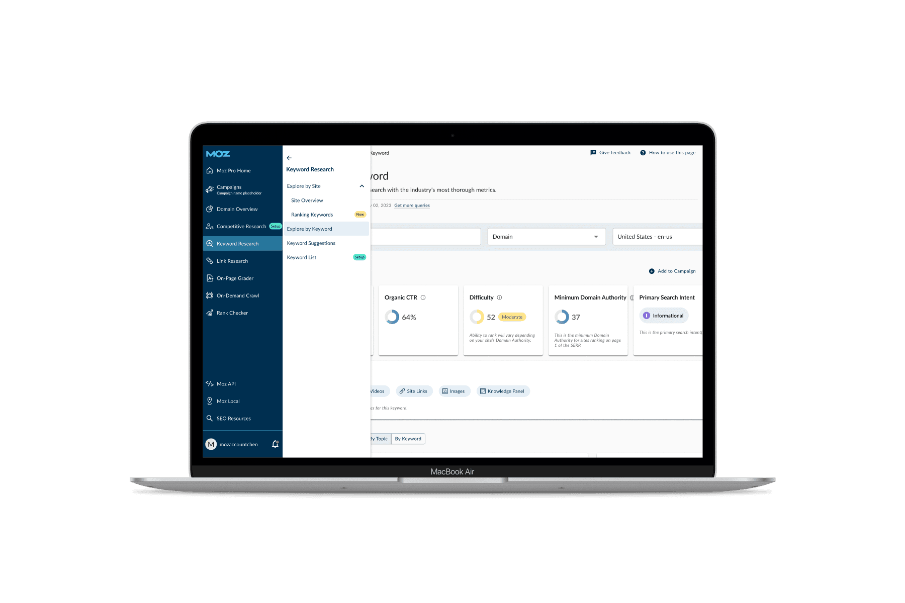
We use Productboard (user analysis tool) to track feedback. Many users mentioned that the vertical stacking of all sections in the old nav made it hard to scan and interact with efficiently.
As more features were added over time, the navigation started to feel cluttered and overwhelming, especially for users trying to access frequently used tools quickly. This feedback made it clear that a redesign was needed to modernize the interface, and better support how users actually navigate through the product day-to-day.
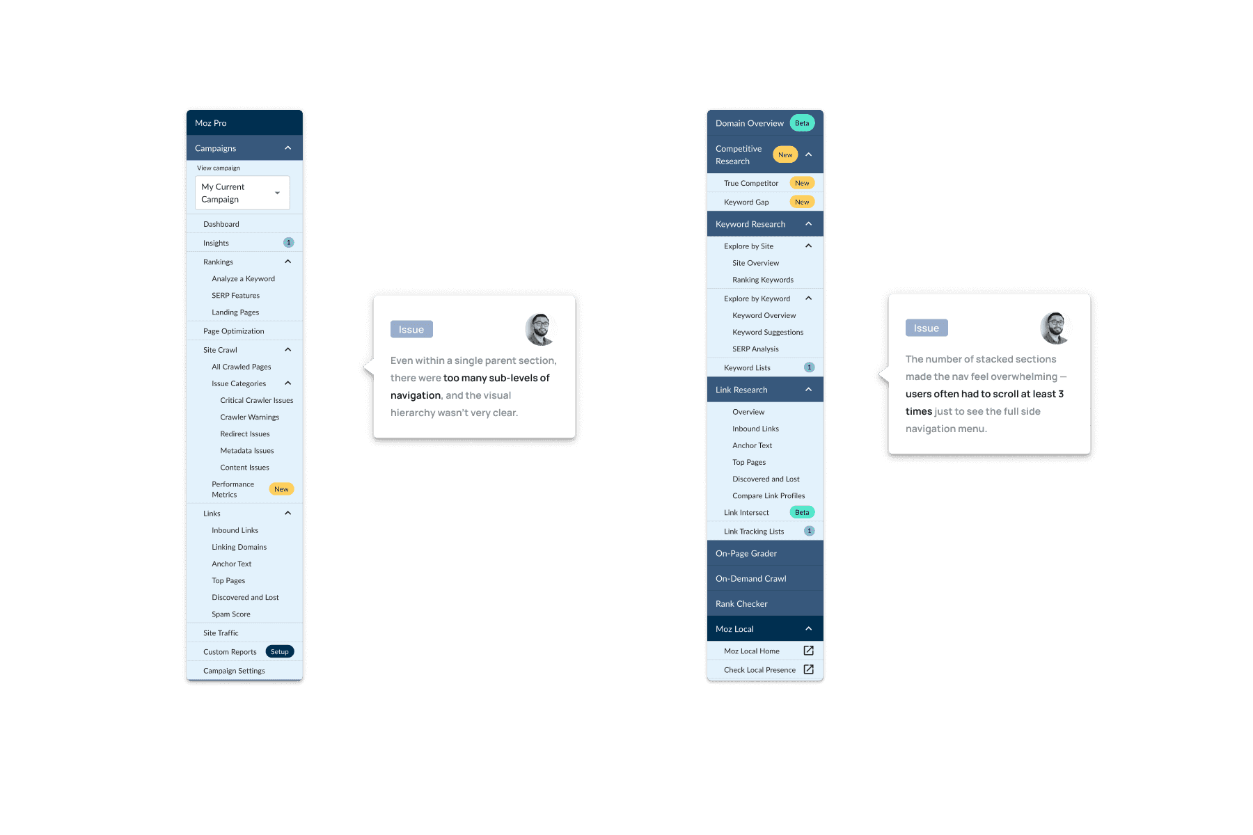
Our tracking tools captured a significant amount of negative feedback about the old navigation experience.

According to Pendo - Our Average Time per Visitor suffered due to a poor navigation design.
With the problem clearly defined, it was time to align on a plan.
I partnered with our Senior PM to put together a detailed project brief, wearing multiple hats and bringing my experience as a UX researcher and UI designer to shape the structure and priorities. I helped define the problem space, break down the user needs, and translate them into clear deliverables.
Together, we mapped out a realistic timeline and identified key stakeholders across design, engineering, marketing, and product. This upfront planning not only brought clarity to the team but also created a shared understanding that kept the project focused and collaborative from start to finish.
It's also crucial to sync on the Measurement of Success which ensure my design solves the real problem.

It was refreshing teaming up with our Sr. PM to draft a plan and a Product Brief. It brought clarity to all.
To start my design phase, I looked outward — gathering inspo from industry leaders and conducting a Competitor Analysis.
I looked at YouTube, Google, Material UI, Spotify, etc and studied their clean, scalable navigation and shared my notes with the rest of the team.
Also, I conducted a thorough competitor analysis to understand how other fast-growing platforms structure their menus, handle complexity, and guide users through dense information.
This research helped me spot patterns, best practices, and opportunities to make Moz Pro stand out. I later documented what worked well (and what didn’t), and used those insights to spark internal discussions and guide early design explorations.
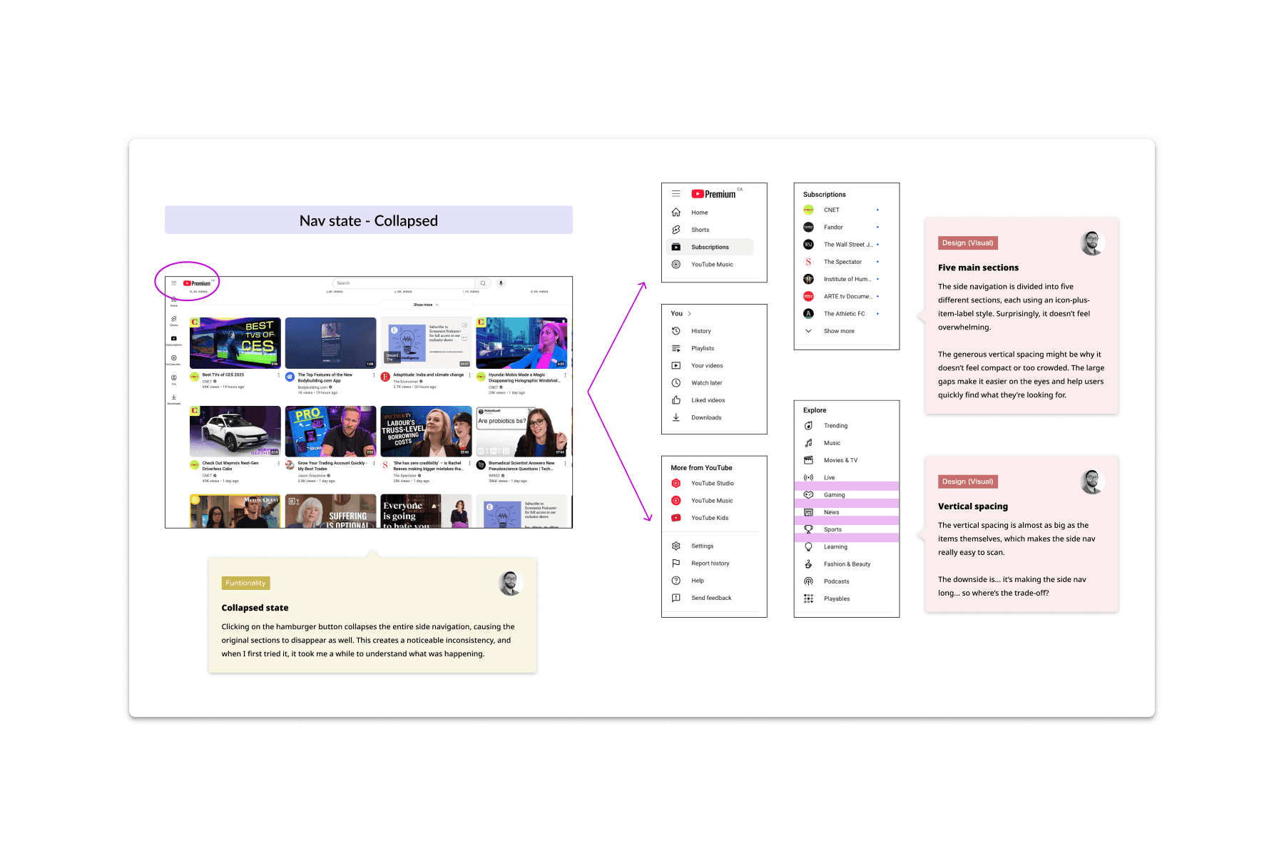
I looked closely at the industry leaders and their navigation.

Also, a comprehensive Competitor Analysis was done as well which helped benchmark our performance.
The boring stuff that brings out tremendous clarity - Information Architecture (This is what I geek out on)
One of my first deep dives was mapping out our existing Information Architecture. I created a full breakdown of the current navigation to highlight duplicated or overlapping menu items that had accumulated over time.
This visual audit made it easier for the team to see where we could consolidate content, merge similar pages, or regroup items more logically. By simplifying the structure, we were able to reduce the overall number of menu items without losing functionality.
Here's a link to the Hi-res pdf if you are curious. https://drive.google.com/file/d/1h7kEHsWyKSZithKpYVJ79Y14bXCYFT9Q/view?usp=sharing
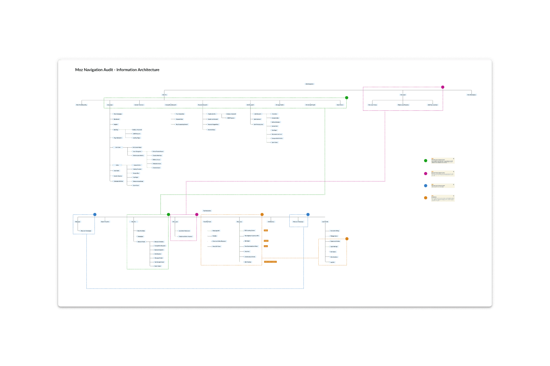
A thorough Information Architecture - See the link above.
Now with the below knowledge locked in, thanks to a comprehensive research and prep work,
✅ We know exactly the user pain points
✅ We know exactly the new structure to rebuild
✅ We know what are the tech constraints and marketing requirements
I hosted a few co design session, where a team of product designers got together and let the creative ideas flow freely. We each brought different perspectives to the table, challenged each other’s thinking, and collaborated in real time to push the designs further.
We weren’t shy about giving honest feedback, and often combined the strongest elements from different concepts into more refined solutions. The result was a set of well-rounded, high-quality design directions that felt both innovative and grounded in real user needs.

We dived right into high fidelity design exploration since UI was a key factor in user satisfaction level.

After rounds of reviews and critiques, this was the Champion we landed on.
Time to bring our design to the test. We created high-fidelity prototype and conducted 6 user testing sessions.
Our UX researcher and I collaborated closely on the testing script to make sure we were uncovering both usability issues and user sentiment.
During the sessions, we observed how users navigated the new structure, where they got stuck, and what felt intuitive. Afterward, we synthesized the findings into clear themes and shared them with the broader team.
Based on the insights, we concluded an Executive Summary and made a few key tweaks. These adjustments later turned out to be deemed valuable by our users.
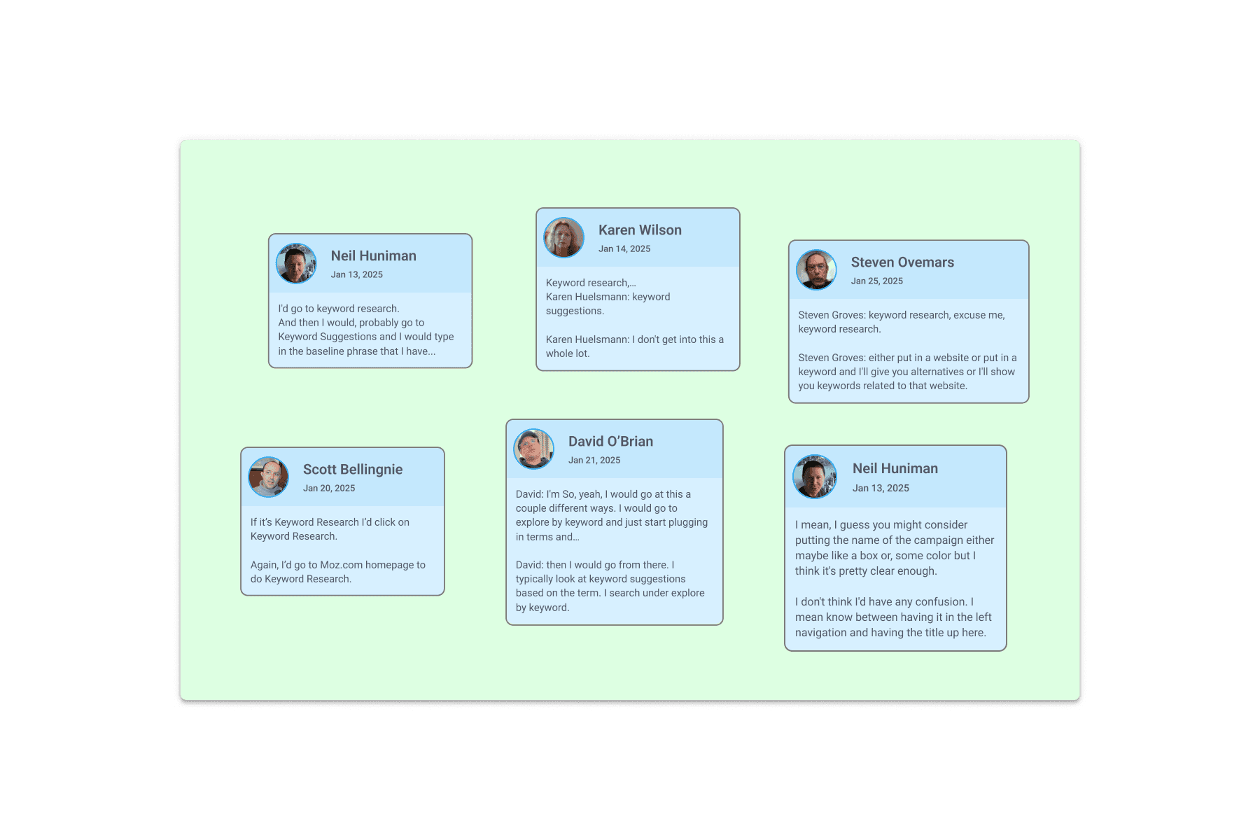
We turned what we observed into over 100 sticky notes that helped synthesize the findings.
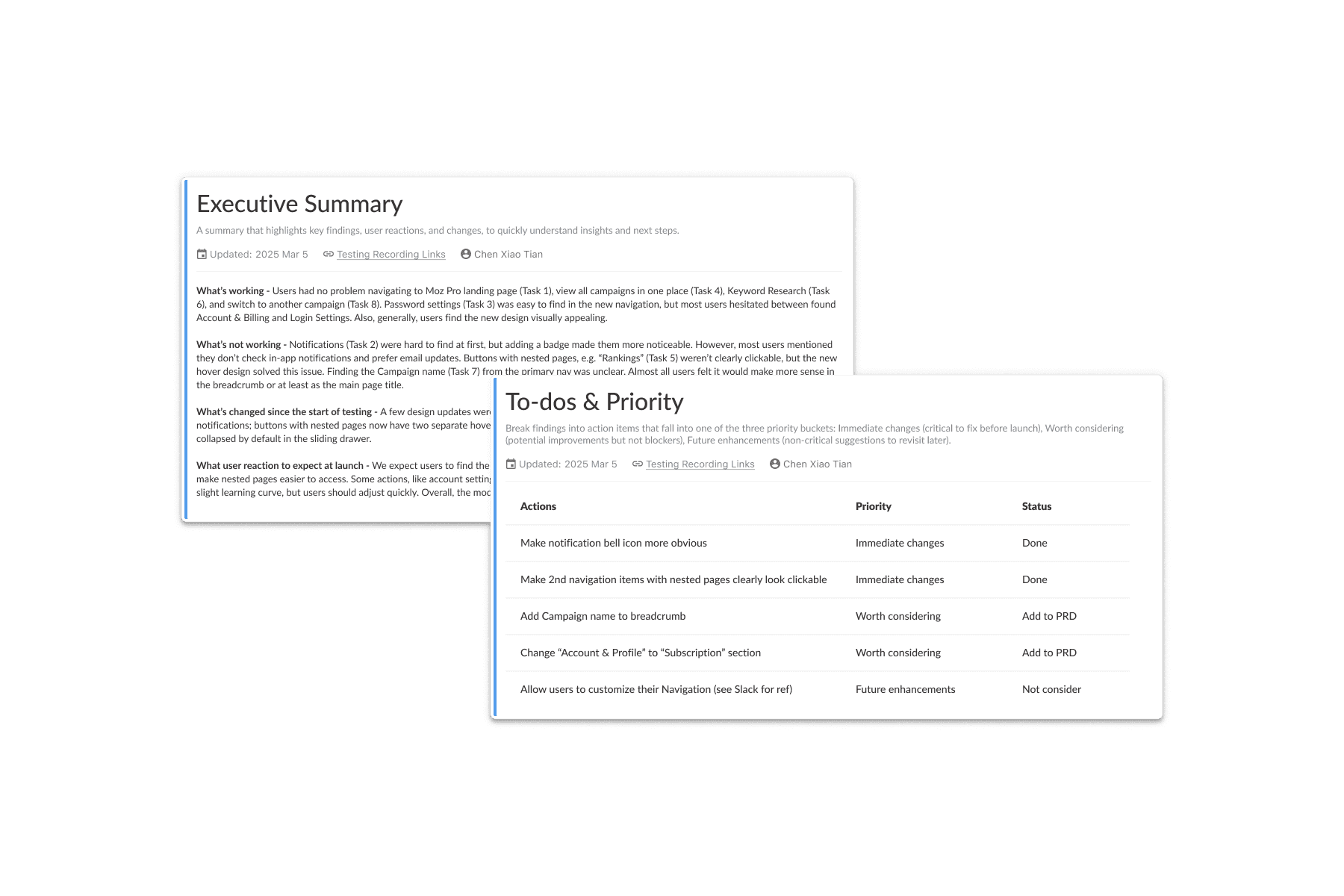
An Executive Summary helped me communicate my findings to the managing level.
Final step, I worked on turning our finalized designs into a set of reusable components and published in our design system.
I collaborated with our design system team to add the new navigation patterns to our shared library, ensuring consistency. I also created detailed specs and dev handoff notes to make the transition smooth for engineers—covering behaviour, states, edge cases, and accessibility.
Once development was underway, I partnered with QA to test implementation across different scenarios and screen sizes, flagging any visual or interaction gaps early. This helped us ship a high-quality, well-integrated navigation experience that felt seamless to users and easy to maintain for the team.
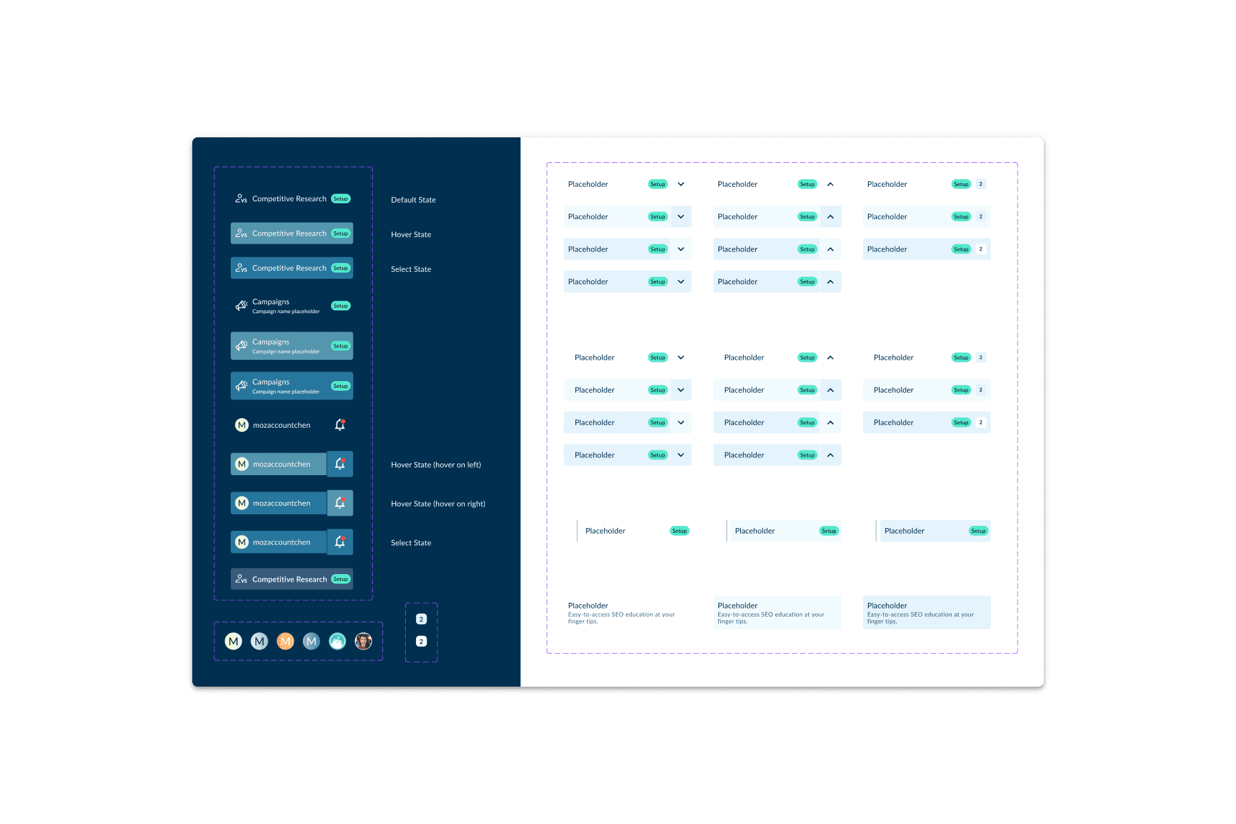
A robust components with each states and interactive patterns.
This project has been one of my favourites, and it's a great reminder for two things:
1️⃣ Tap into user data is everything
Metrics like rage clicks, time per task, and user drop-offs helped us pinpoint exactly where people were struggling. That data became our north star, keeping our decisions grounded in real user behaviour rather than assumptions.
2️⃣ Learn from industry leaders
Many of the challenges we faced—like scaling navigation or managing complexity—have already been tackled by bigger players. Studying how they solved it gave us a huge head start. It’s not just okay to borrow smart ideas—it’s smart to do so. The real value comes from adapting and evolving those patterns to fit our unique context.